Post 7
A Gentleman's Wager, but without the blue-eyed blond heartthrob
Originally drafted as Journal #7 in July 2026, alongside the Projects-page vlog. It never made it to publication. We finally finished it.
We kept changing the Projects page.
A Junghans Max Bill has very little on its dial. Move one thing a little too far, make one mark a little too heavy, shorten a hand, and very little has changed. The watch has.1
So we changed the type again.
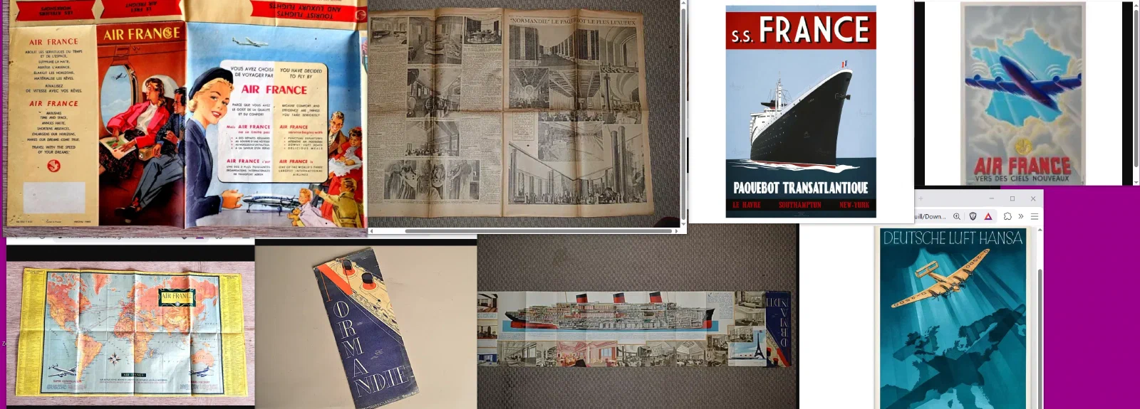
The reference folder held Air France brochures and route maps, Normandie cutaways, posters for France, Lufthansa aircraft, Fife yachts and Italian yachts, watches, bottles, hotel interiors and old advertisements. The Gentleman’s Wager was there too, with Sincerity, very good clothes, very expensive whisky and the blue-eyed blond heartthrob promised by the title.2
The cutaway of Normandie had to explain an enormous ship on one sheet of paper and still make you want to cross the Atlantic in it. Air France had routes and timetables to communicate, but the brochures also had to make flight desirable.3 Fife still had to make a yacht sail. Riva still had to make a boat work, and make one worth looking back at after you had tied it up.4
Louis Sullivan’s line is usually shortened to form follows function.5 The difficult word is function. If the Projects page only had to provide links, a list would have done.
My Mephistos are ten years old now and the uppers finally look it. They have spent those ten years on my feet through days that went on far too long. I have trouble calling a four-hundred-euro shoe elegant if I cannot imagine wearing it for twenty hours. A Santos has to tell the time, but that is not the whole job.6 Talisker is sold in supermarkets.7 The shelf at home also holds Dingle, Laphroaig, Tamnavulin and Bunnahabhain, and there are evenings when Talisker is still exactly the bottle I want.
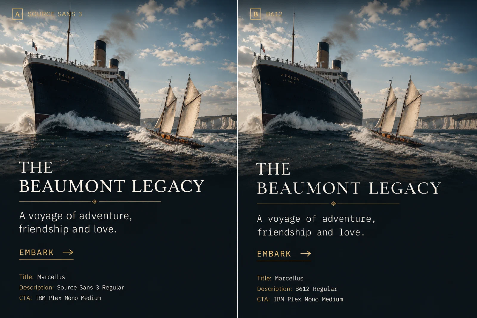
Source Sans 3 became B612. The ship, the Marcellus title, the brass rule and Embark stayed where they were. We tried the same change on another image.
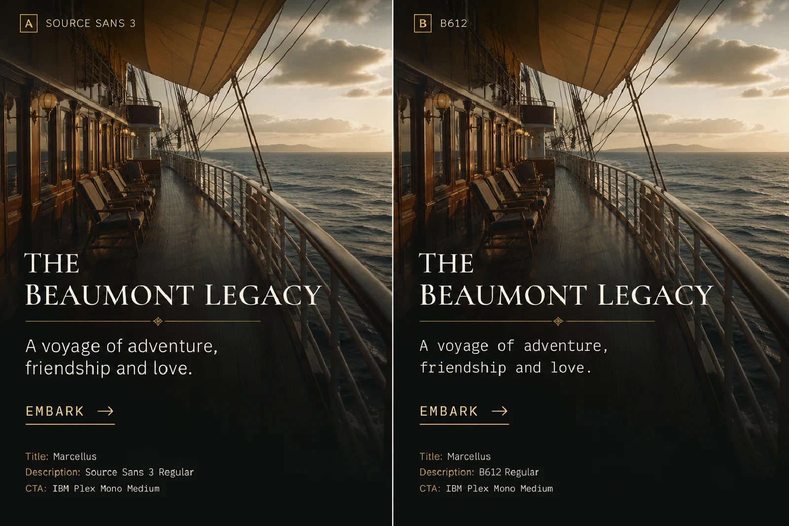
Hemingway could leave something unsaid because the reader had already been given enough to supply it.8 Yourcenar did not need the same economy. In La Veuve Aphrodissia, the village, Kostis, the widow, the anger turned on her and the years ahead are all there before the cliff. She does not explain the fall.9
On an Arden page, a line could occupy half the space because the empty half was part of the presentation.10
Less is more, but even less must be presented properly.11
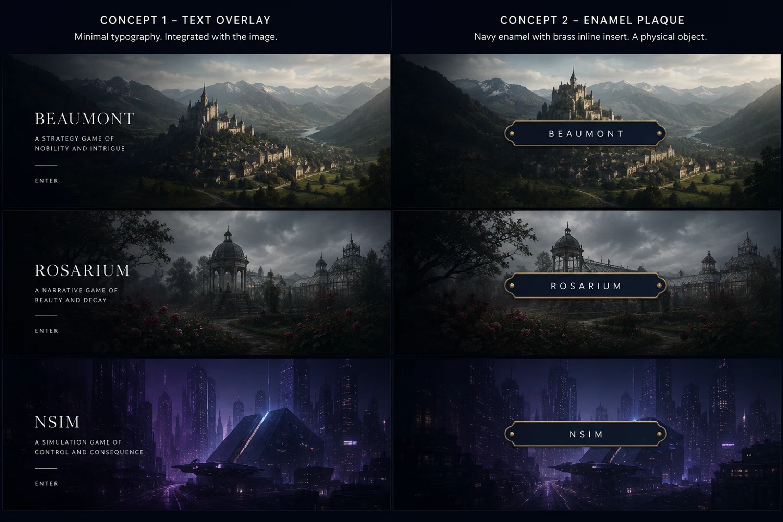
The enamel plaque was one of the more seductive answers. Navy enamel and brass trim gave it the weight of a physical object rather than an overlay, and it looked convincing over Beaumont, Rosarium and NSIM. Perhaps too convincing. The plaque was beginning to dominate all three.
Tschichold’s work at Penguin is useful here: the books could look like Penguin without becoming the same book.12 Aicher faced the same problem at Lufthansa, across aircraft, tickets, counters, timetables and signs.13
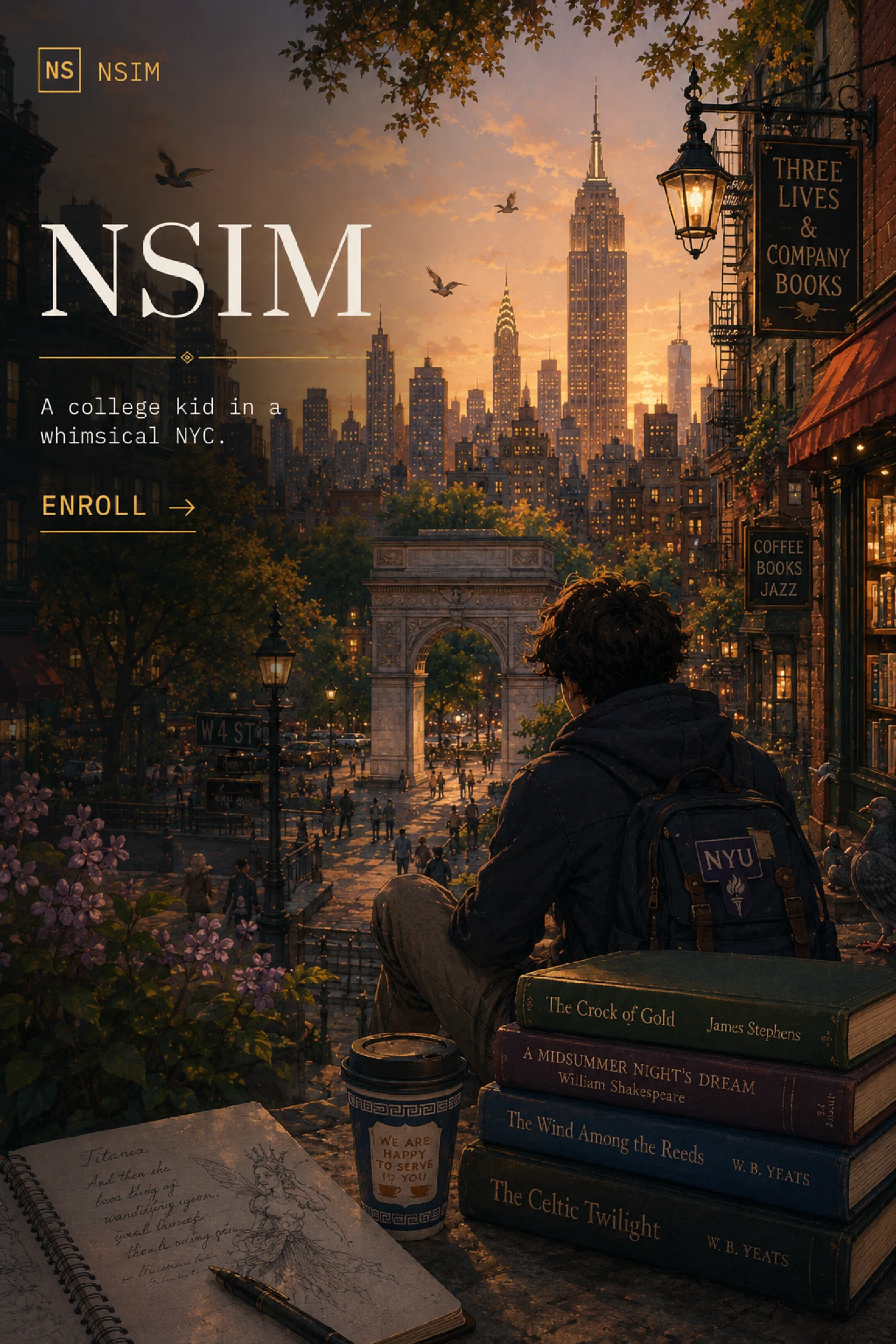
NSIM brought New York in autumn, books and coffee, Yeats, Shakespeare and an NYU bag. There was no sensible reason to make any of that behave like Beaumont. The small square mark and the brass rule stayed, like the title and call to action. New York, the books, autumn light, typography danced on the scene they built.
Beaumont was the easier fit.
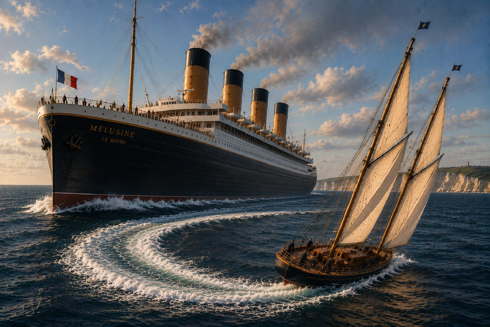
Finnbharr’s dark hull and brass lettering sit in front of Mélusine’s white superstructure, with the same blue water running through both. Fife and the great liners had been in the folders for months. FFG already used navy, cream, brass and serif type. Beaumont arrived with ships, machinery and much of the same palette.
At some point, a Projects page has to stop being a project.
The games had not. There were builds to make, scenes to write, art to finish, Steam to prepare.
So we put them back at the top of the list.
Johnnie Walker’s Gentleman’s Wager Recipe
This cocktail was published as the Johnnie Walker Blue Label Gentleman’s Wager recipe, after the short film of the same name featuring the wonderful Sincerity — a 1928 Baglietto yacht designed by Vincenzo Baglietto.14
Ingredients
45ml Johnnie Walker Blue Label
10ml Pedro Ximénez sherry
5ml Poire Williams Eau de Vie (dry)
3 drops Peychauds Bitters
Method
Build all the ingredients into a bespoke whisky tumbler over one cube of ice and gently stir.
Reading and references
Uhrenfabrik Junghans, Junghans max bill.
Cité de l’architecture et du patrimoine, Paquebot Normandie, coupe longitudinale et vues intérieures; Air France, Creations.
William Fife, Fife History; Riva, History.
Louis H. Sullivan, The Tall Office Building Artistically Considered, 1896.
Cartier, Santos de Cartier.
Ernest Hemingway, Death in the Afternoon (1932); The Art of Fiction No. 21, The Paris Review, 1958.
Marguerite Yourcenar, Nouvelles orientales, Gallimard; BnF bibliographic record.
Paul Arden, It’s Not How Good You Are, It’s How Good You Want to Be, Phaidon.
Museum of Modern Art, Ludwig Mies van der Rohe.
Design Museum, Penguin Books, on Jan Tschichold’s templates and Composition Rules.
IDZ / Otl Aicher 100, Design beflügelt and Alpha wolves, on the Lufthansa corporate design programme.
Classic Driver, The Gentleman’s Wager: How to win a yacht with a dance; Sandeman Yacht Company, Sincerity — Baglietto 88 ft Marconi Ketch 1928.
Junghans describes Max Bill as a Bauhaus student who worked without ornament or embellishment, and presents the dial as the defining element of the collection: Junghans — max bill. ↩︎
The Gentleman’s Wager was a 2014 Johnnie Walker Blue Label short film starring Jude Law and Giancarlo Giannini; Sincerity is the 1928 Baglietto yacht used in the film. See Classic Driver and Sandeman Yacht Company. ↩︎
Albert Sébille’s 1935 Normandie advertising foldout combined a longitudinal cutaway with interior views; the Cité de l’architecture et du patrimoine preserves an example. Air France’s own design history describes its early posters as invitations to travel, built around aircraft, sky, destination and corporate identity. See Cité de l’architecture et du patrimoine and Air France — Creations. ↩︎
The William Fife archive describes Fife III’s yachts in terms of beauty of line, construction quality, speed and inventiveness. Riva’s history describes Carlo Riva’s 1950s–60s work as turning boat design into an art form while continuing to foreground engineering, reliability and performance. See William Fife — Fife History and Riva — History. ↩︎
Sullivan’s original 1896 wording in The Tall Office Building Artistically Considered was “form ever follows function”; the familiar shorter form came later. See the 1896 excerpt. ↩︎
Cartier dates the Santos-Dumont story to 1904: Louis Cartier answered Alberto Santos-Dumont’s wish to read the time while flying, producing one of the earliest wristwatches and a design that became an enduring Cartier signature. See Cartier — Santos-Dumont. ↩︎
For the deliberately un-exotic claim: Carrefour France currently lists Talisker Skye and Talisker Storm among its whiskies. Carrefour France — Talisker. ↩︎
Hemingway formulated his “theory of omission” in Death in the Afternoon (1932): what the writer knows may remain below the surface if the reader can still feel it. See Poynter’s discussion of the passage and Hemingway’s later Paris Review interview. ↩︎
Marguerite Yourcenar, “La Veuve Aphrodissia,” in Nouvelles orientales. The revised collection appeared with Gallimard in 1963 and the later edition in 1978. See the BnF catalogue record and Yourcenariana’s publication history. ↩︎
Paul Arden, It’s Not How Good You Are, It’s How Good You Want to Be (Phaidon). The book itself is as much layout as prose: short propositions, image, scale and empty space are made to share the argument. Phaidon. ↩︎
“Less is more” is strongly associated with Ludwig Mies van der Rohe. MoMA describes it as his oft-quoted aphorism while also stressing his attention to rich materials, surfaces and detail. MoMA — Ludwig Mies van der Rohe. ↩︎
Jan Tschichold joined Penguin in 1946, imposed coherent templates and produced Composition Rules for its typographers and printers while allowing distinct series to retain their own treatments. Design Museum — Penguin Books. ↩︎
From 1962, Otl Aicher and HfG Ulm’s E5 group developed Lufthansa’s corporate design across the airline’s livery and communications. The surviving standards covered such things as brochures, advertising, tickets, counters and uniforms, with a common grid, type system and colours. See Otl Aicher 100 — Design beflügelt and Alpha wolves. ↩︎
The recipe quantities match the Johnnie Walker Blue Label Gentleman’s Wager recipe reproduced by INKD. Sincerity was designed by Vincenzo Baglietto and built by Cantieri Baglietto in 1928; the yacht’s current Sandeman specification also records its appearance in the 2014 film: Sandeman Yacht Company. ↩︎