Post 1
Visual Language and Web Design
Deriving a Visual Language: How Flying Fortress Games Approached Website Design
When we started working on the Flying Fortress Games website, we deliberately chose not to begin with colors, typography or layouts.
Those decisions only make sense once they express something coherent.
The purpose of this exercise was therefore not to design a website, but to derive a visual language capable of expressing what Flying Fortress Games already is.
Over the course of roughly a week, that process produced three Markdown documents, dozens of comparisons, multiple discarded concepts, and eventually one visual direction that felt consistent enough to become the studio’s public face.
This article documents that process. It is not a design methodology or a tutorial. It is a development journal describing how we approached one specific engineering and design problem.
What We Didn’t Do
Three misconceptions are worth addressing before discussing the process itself.
We did not reject “typical indie aesthetics.” There is nothing inherently wrong with them. We simply looked for a direction that reflected Flying Fortress Games.
We did not discover the identity of the studio. That already existed through years of projects, discussions and design work. The objective was to derive an appropriate visual language from that existing identity.
Finally, this article is not intended as a prescriptive guide. It documents our approach, our reasoning and our decisions.
The Problem
Every design project begins with an objective.
Ours was straightforward:
Build the Flying Fortress Games website.
The difficulty was that this objective was still underspecified.
Before discussing implementation, we needed a common vocabulary capable of describing the atmosphere we wanted the website to project.
Only then could individual design decisions become meaningful.
The Process
The work followed a simple progression. Each phase was completed before moving to the next.
Problem
  ↓
Exploration
  ↓
Vocabulary
  ↓
Comparison
  ↓
Specification
  ↓
Implementation
Rather than immediately producing mockups, the process focused on reducing ambiguity until implementation became a matter of engineering rather than intuition.
Exploration
The first phase deliberately explored several radically different visual directions.
These were not competing website designs.
They were hypotheses.
Each attempted to express one possible interpretation of Flying Fortress Games.
The explored directions included:
- Aviation Engineer
- Blueprint Studio
- Technical Manual
- Officer’s Study / Red Salon
- French Industrial Art Deco
- Hamptons Explorer
- Editorial Art Deco
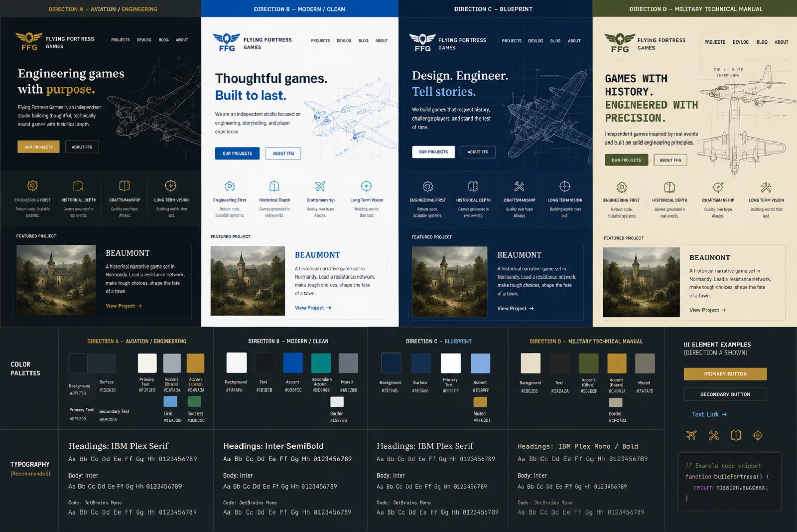
Some concepts, such as the gorgeous ‘Celestial Fortress’ were eventually discarded after discussion. Too different from what we felt FFG really is.
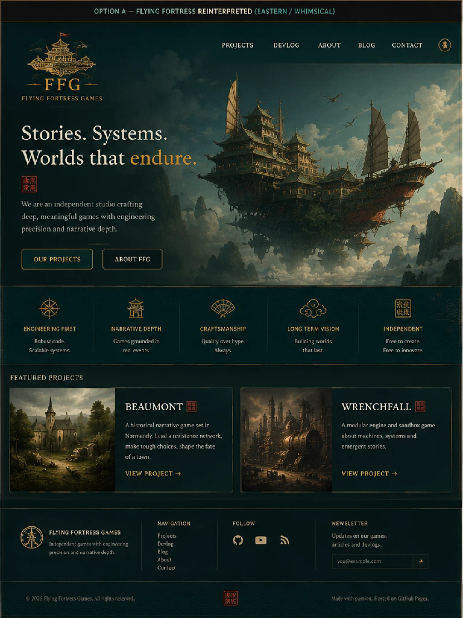
At this stage, no attempt was made to choose a winner.
The objective was to understand the available design space.
Building a Vocabulary
As the discussions progressed, the conversation gradually shifted away from individual mockups.
Instead of discussing preferences, we began describing each direction through the same dimensions.
For every candidate we identified:
- atmosphere
- concepts
- values
- typography
- materials
- visual language
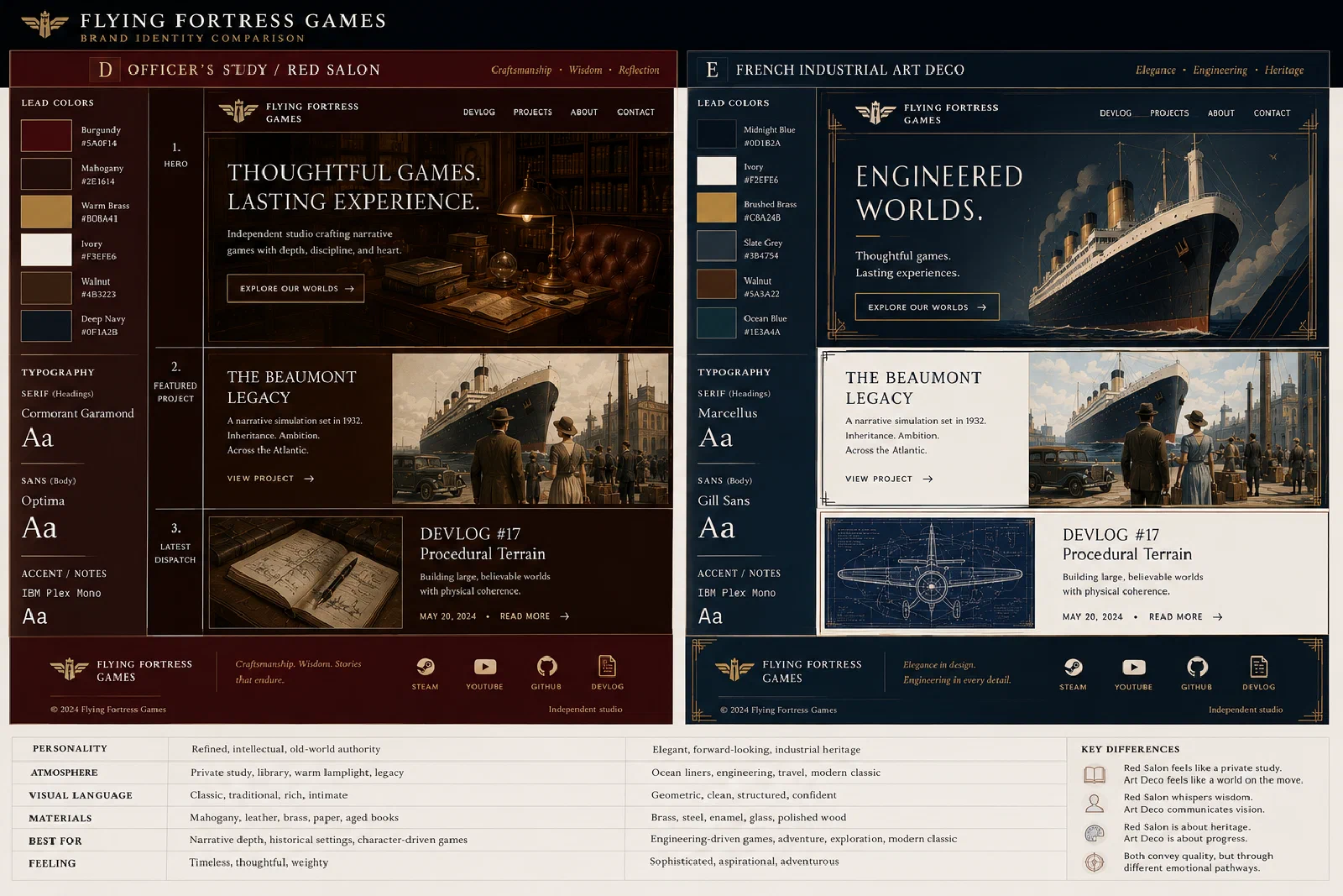
Naming each direction was a surprisingly important step. “Option 4” quickly became “Red Salon.” “Option 6” became “French Industrial Art Deco.” Once each direction had a stable name, discussion became significantly more precise.
Comparison
Once every direction could be described using the same vocabulary, systematic comparison became possible.
The objective was not to rank designs.
Instead, we looked for recurring characteristics among the directions that consistently felt aligned with Flying Fortress Games.
This phase eventually produced comparison tables summarizing:
- atmosphere
- typography
- materials
- colors
- strengths
- weaknesses
The comparison itself became one of the project’s primary design artifacts.
Selection
French Industrial Art Deco gradually emerged as the direction that most consistently reflected the atmosphere we wanted to communicate.
Its defining idea became:
Engineering + Culture
From that point onward, individual design decisions became considerably easier.
The selected direction naturally suggested a broader mood that we eventually described as Industrial Optimism.
This is not nostalgia for the 1920s.
It reflects a view of engineering as something disciplined, optimistic and culturally significant.
Gustave Eiffel himself captured this relationship between craft and culture:
“Because we are engineers, does one assume that beauty does not concern us in our constructions, and that while we strive to build solid and durable structures, we do not also endeavor to make them elegant? Are not the true conditions of strength always in harmony with the secret conditions of beauty?”
Visual Language
Once the direction had been selected, concrete design decisions followed.
Palette
- Midnight Blue
- Ivory
- Brushed Brass
- Walnut
- Slate Grey
- Ocean Blue
Typography
- Marcellus
- Gill Sans
- IBM Plex Mono
Identity Principles
- engineering precision
- craftsmanship visible in the details
- cultural depth without pretension
- restrained elegance over spectacle
- structured composition
- Art Deco detailing used as an accent rather than the centerpiece
Every decision traces back to the same underlying atmosphere.
Visual Identity as Technical Debt
One idea repeatedly resurfaced throughout the project.
Visual identity behaves much like technical debt.
Individual inconsistencies rarely matter in isolation.
Over time, however, they accumulate into a system that becomes increasingly difficult to maintain.
For that reason, visual consistency deserves the same deliberate attention as software architecture.
Documentation
The design process produced three working documents.
Website_FFG_Brand_Comparison.history.mdWebsite_FFG_Design.mdWebsite_FFG_Roadmap.md
Together they record:
- the explored alternatives
- the selected visual language
- the implementation strategy
They are internal engineering documents rather than public deliverables.
Current Status
The design phase is now complete.
The project possesses:
- a selected visual direction
- a documented visual language
- a documented implementation roadmap
Implementation can now begin using:
- GitHub Pages
- Hugo
- Tailwind CSS
And so it begins.